Data visualization in R: line charts
My previous post was about how we can download data from Statistic Denmark. Here, we will use these data for learning to plot line charts in R using ggplot2. In the way, we will see:
- How to download data from Statistic Denmark.
- How to clean a dataframe and manipulate it to calculate the values we would like to plot.
- Generate line charts with ggplot2.
- Make multi-panel plots.
- Tune the look of a plot for producing beautiful charts.
We will use the following libraries:
library(danstat)
library(tidyverse)
library(furrr)
library(forcats)
library(dint)
The first think I do when I produce a figure is to think about what I would like to tell with it. In this case I would like to see the population change (in percentage) in each Danish municipality from 2008 to 2020, both by the total population and by separating the data in persons of Danish origin and foreigners (i.e immigrants and their descendants).
Load data
We need the Population at the first day of the quarter by region, sex, age (5 years age groups), ancestry and country of origin - table FOLK1C.
id_table <- "FOLK1C"
var_pop <- get_table_metadata(table_id = id_table, variables_only = TRUE)

# loop by quarter for getting the data
  steps <- function(quarter){
      var_values <- list(id_region, id_ancestry, quarter)
      var_input <- purrr::map2(.x = var_codes, .y = var_values, .f = ~list(code = .x, values = .y))
      get_data(id_table, variables = var_input)
  }

# Codes for var_input
  var_codes <- c("OMRÅDE", "HERKOMST", "Tid")

  # Values for var_input
  ## Region: Denmark
  id_region <- as.numeric(var_pop$values[[1]]$id)
  id_region <- id_region[id_region > 100]
  ## Ancestry
  id_ancestry <- NA
  ## Quarters
  id_quarter <- var_pop$values[[6]]$id   # Select all quarters
  # Parallel process with {future}
  plan(multiprocess)
  pop_LAU <- id_quarter %>% future_map(steps)
  pop_LAU <- bind_rows(pop_LAU)
  plan("default")

  pop_LAU
## # A tibble: 20,592 x 4
## OMRÅDE HERKOMST TID INDHOLD
## <chr> <chr> <chr> <dbl>
## 1 Copenhagen Total 2008Q1 509861
## 2 Copenhagen Persons of Danish origin 2008Q1 405954
## 3 Copenhagen Immigrants 2008Q1 77114
## 4 Copenhagen Descendant 2008Q1 26793
## 5 Frederiksberg Total 2008Q1 93444
## 6 Frederiksberg Persons of Danish origin 2008Q1 79257
## 7 Frederiksberg Immigrants 2008Q1 11524
## 8 Frederiksberg Descendant 2008Q1 2663
## 9 Dragør Total 2008Q1 13261
## 10 Dragør Persons of Danish origin 2008Q1 12432
## # ... with 20,582 more rowsClean and prepare the data
As we can see, the column names are in Danish. Therefore, we would need to rename them (i.e. OMRÅDE = LAU_NAME, HERKOMST = ancestry, TID = date, and INDHOLD = pop). We can use the function rename (from dplyr). For this, we put first the new name of the column (e.g. LAU_NAME) and then we link it with the name of the old column (i.e. OMRÅDE). See the first part of the following code. Then, we would need to convert TID from a character format to dates. As the data represent the Population at the first day of the quarter, our objective is therefore to transform the value (e.g. “2008Q1”) to the first day of the quarter (e.g. “2008-01-01”). We can do that with the dint package. First, we need to convert the value to a year-quarter date format (e.g. “2008-Q1”) using the function as_date_yq, which take a value (i.e. 20081) representing the year (2008) and the quarter (i.e. 1, 2, 3, 4 for the first, second, third, or four quarter, respectively). This is why I remove the Q from the value using gsub. Once we have the year-quarter we past it to first_of_quarter for calculating the first day of a quarter. Finally, I have change a level of ancestry (i.e. Persons of Danish origin -> Danish) and transform the dataframe to its wide format putting each value in a column (i.e. Total, Danish, Immigrant, and Descendant).
pop_LAU <- pop_LAU %>%
  # translate columns names into English
  rename(LAU_NAME = OMRÅDE,
         ancestry = HERKOMST,
         date = TID,
         pop = INDHOLD) %>%
  # Transform date
  mutate(date = gsub("Q", "", date),
         date = as_date_yq(as.integer(date)),
         date = first_of_quarter(date)) %>%
  # Change "Persons of Danish origin"
  mutate(ancestry = ifelse(ancestry == "Persons of Danish origin",
                           "Danish",
                           ancestry)) %>%
  # Pivot data to wide format
  pivot_wider(c(LAU_NAME, date), names_from = ancestry, values_from = pop)

pop_LAU
## # A tibble: 5,148 x 6
## LAU_NAME date Total Danish Immigrants Descendant
## <chr> <date> <dbl> <dbl> <dbl> <dbl>
## 1 Copenhagen 2008-01-01 509861 405954 77114 26793
## 2 Frederiksberg 2008-01-01 93444 79257 11524 2663
## 3 Dragør 2008-01-01 13261 12432 733 96
## 4 Tårnby 2008-01-01 40016 36267 2889 860
## 5 Albertslund 2008-01-01 27602 20718 4408 2476
## 6 Ballerup 2008-01-01 47116 41708 3746 1662
## 7 Brøndby 2008-01-01 33831 25743 5146 2942
## 8 Gentofte 2008-01-01 68913 61568 6451 894
## 9 Gladsaxe 2008-01-01 62562 54605 5848 2109
## 10 Glostrup 2008-01-01 20673 18327 1640 706
## # ... with 5,138 more rowsThen, we would need to divide the population in two categories, Danes and foreigners (the sum of immigrants and their descendants). The function mutate is used to generate this new variable, and then I use select to get only the columns I will use for the figure.
pop_LAU <- pop_LAU %>%
  mutate(Foreign = Immigrants + Descendant) %>%
  select(-Immigrants, -Descendant)

pop_LAU
## # A tibble: 5,148 x 5
## LAU_NAME date Total Danish Foreign
## <chr> <date> <dbl> <dbl> <dbl>
## 1 Copenhagen 2008-01-01 509861 405954 103907
## 2 Frederiksberg 2008-01-01 93444 79257 14187
## 3 Dragør 2008-01-01 13261 12432 829
## 4 Tårnby 2008-01-01 40016 36267 3749
## 5 Albertslund 2008-01-01 27602 20718 6884
## 6 Ballerup 2008-01-01 47116 41708 5408
## 7 Brøndby 2008-01-01 33831 25743 8088
## 8 Gentofte 2008-01-01 68913 61568 7345
## 9 Gladsaxe 2008-01-01 62562 54605 7957
## 10 Glostrup 2008-01-01 20673 18327 2346
## # ... with 5,138 more rowsThe next step is to calculate, for each municipality, the percentage of change of the total, Danish, and foreign population using 2008 as baseline. First, I transform the data to its long format (pivot_longer) for having one row for each measurement. Then, I calculate the percentage for each group of people (i.e ancestry = Danish, Foreign, Total) and each municipality (i.e. LAU_NAME). I use mutate for doing that but the data must be grouped (group_by) to be sure the formula is applied separately in each group. Once we have finished with the calculations, it is recommended to ungroup the data for not getting unexpected behaviours in future calculations with the variables. The final step of the chunk is to customize the labels of the variable we are going to use in the legend of the figure (i.e. ancestry).
pop_LAU <- pop_LAU %>%
  # Pivot to long format
  pivot_longer(-c(LAU_NAME, date), names_to = "ancestry", values_to = "pop") %>%
  # Percentage of change (baseline 2008-Q1)
  group_by(LAU_NAME, ancestry) %>%
  arrange(LAU_NAME, date) %>%
  mutate(pop_pct_2008 = (pop/first(pop) - 1) * 100) %>%
  ungroup() %>%
  # Sort ancestry
  mutate(ancestry = factor(ancestry,
                           levels = c("Danish",
                                      "Foreign",
                                      "Total"),
                           labels = c("Danish",
                                      "Foreign (Immigrants + Descendant)",
                                      "Total")))

pop_LAU
## # A tibble: 15,444 x 5
## LAU_NAME date ancestry pop pop_pct_2008
## <chr> <date> <fct> <dbl> <dbl>
## 1 Aabenraa 2008-01-01 Total 60189 0
## 2 Aabenraa 2008-01-01 Danish 54165 0
## 3 Aabenraa 2008-01-01 Foreign (Immigrants + Descendant) 6024 0
## 4 Aabenraa 2008-04-01 Total 60283 0.156
## 5 Aabenraa 2008-04-01 Danish 54202 0.0683
## 6 Aabenraa 2008-04-01 Foreign (Immigrants + Descendant) 6081 0.946
## 7 Aabenraa 2008-07-01 Total 60427 0.395
## 8 Aabenraa 2008-07-01 Danish 54318 0.282
## 9 Aabenraa 2008-07-01 Foreign (Immigrants + Descendant) 6109 1.41
## 10 Aabenraa 2008-10-01 Total 60368 0.297
## # ... with 15,434 more rowsFinally, since we are more interested in the process of plotting line chards in R and not the comparison between the 98 municipalities, I have simplified the dataset to the main four municipalities (i.e. Aarhus, Aalborg, Odense, and Copenhagen).
  big_cities <- c("Aarhus", "Aalborg", "Odense", "Copenhagen")
  pop_LAU <- pop_LAU %>% filter(LAU_NAME %in% big_cities)

  pop_LAU
## # A tibble: 624 x 5
## LAU_NAME date ancestry pop pop_pct_2008
## <chr> <date> <fct> <dbl> <dbl>
## 1 Aalborg 2008-01-01 Total 195145 0
## 2 Aalborg 2008-01-01 Danish 181159 0
## 3 Aalborg 2008-01-01 Foreign (Immigrants + Descendant) 13986 0
## 4 Aalborg 2008-04-01 Total 195145 0
## 5 Aalborg 2008-04-01 Danish 180993 -0.0916
## 6 Aalborg 2008-04-01 Foreign (Immigrants + Descendant) 14152 1.19
## 7 Aalborg 2008-07-01 Total 195048 -0.0497
## 8 Aalborg 2008-07-01 Danish 180960 -0.110
## 9 Aalborg 2008-07-01 Foreign (Immigrants + Descendant) 14088 0.729
## 10 Aalborg 2008-10-01 Total 196138 0.509
## # ... with 614 more rowsPlot line charts
Now that we have the data, we can plot the line chart using the function geom_line from ggplot2 package. For plotting a graph with ggplot2 we first need to call a new ggplot object with the function ggplot, and then we add more information to this object step by step using the operator +. I see it as layers where I define the information I want to plot and its format, so when I add geom_line in the code I am telling R that the data should be connected with a line. If I were also interested, for example, in adding each data as a points in the graph, I would add another line with geom_point.
There are three ways to initialize a ggplot object with ggplot, I would recommend you to read the help to understand the process. Here, I am using the same data and the same set of aesthetics in all plots so I define then in this step. We need a dataframe (pop_LAU) and also to specify what data are going to be plotted in the axes (i.e. x = years and y = population change in percentage). Then, we also need to define the parameter (colour) into the aesthetic for plotting each group of data (i.e. ancestry = Danish, Foreign, and Total population) with different colours. Note that this variable is printed in the legend, with the same order and labels we defined before. Finally, we can plot the variation by municipality (LAU_NAME) using the function facet_wrap.
ggplot(data = pop_LAU,
       mapping = aes(x = date,
                     y = pop_pct_2008,
                     colour = ancestry)) +
  geom_line(size = 1) +
  facet_wrap(~LAU_NAME, ncol = 2)
We already have the plot; however, there are some aspects we can clearly improve on it. For example, the municipalities in the graph are sorted alphabetically but I think the figure could be more informative if we sort them base on the total population in 2020 (even more if we would like to plot the 98 municipalities in the same plot). A way to do that is to use the forcats:fct_reorder2 function before calculating the percentage of population change. It takes a factor variable (i.e. LAU_NAME) and arranges it base on the value of other variables (Total = total population and date). The argument last2 finds the last value of y (i.e. total population) when sorted by x (date).
pop_LAU <- pop_LAU %>%
  # Pivot data to wide format
  pivot_wider(c(LAU_NAME, date), names_from = ancestry, values_from = pop) %>%
  # Sort LAUs by Total population in 2020-Q4
  mutate(LAU_NAME = factor(LAU_NAME),
         LAU_NAME = fct_reorder2(.f = LAU_NAME,
                                 .x = date,
                                 .y = Total,
                                 .fun = last2)) %>%
  # Long format
  pivot_longer(-c(LAU_NAME, date), names_to = "ancestry", values_to = "pop") %>%
  # Percentage of change (baseline 2008-Q1)
  group_by(LAU_NAME, ancestry) %>%
  arrange(LAU_NAME, date) %>%
  mutate(pop_pct_2008 = (pop/first(pop) - 1) * 100) %>%
  ungroup()
Therefore when we plot the graph we can see that Copenhagen appears first in it, then Aarhus, Aalborg, and Odense. In this sense, we can see the importance of each municipality (in terms of population) just only by looking for its position in the chard. Here, with only four municipalities, it may not be very useful but with all the 98 municipalities it can make a different in the interpretation (e.g. easily detect urban and rural areas).
p <- ggplot(data = pop_LAU,
       mapping = aes(x = date,
                     y = pop_pct_2008,
                     colour = ancestry)) +
  geom_line(size = 1) +
  facet_wrap(~LAU_NAME, ncol = 2)

p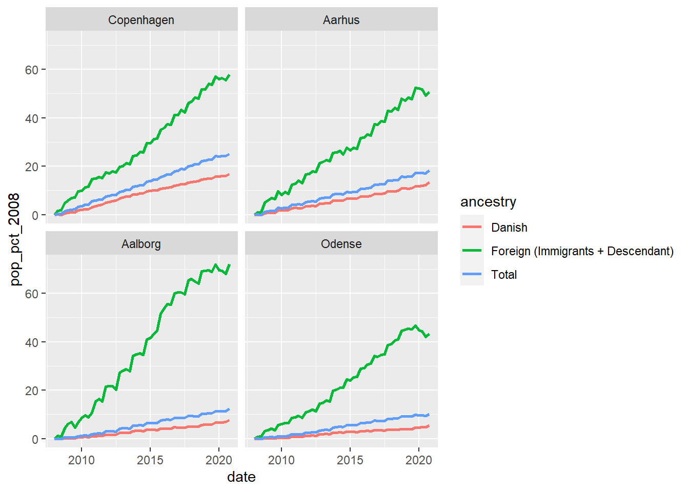
There are still some things we can improve in the figure. First, the legend text is too large ant it seems more adequate to put the legend at the bottom. Then, we can change the text of the x axis to clearly annotate that it is in percentage. Regarding the horizontal axis, it is clear that it represents years so we may not need to name it. Furthermore, it can be useful to only plot the last to digits of the year. I have also change the colours of the lines for using a colour blind friendly palette. Finally, we can add titles and captions for explaining what is presented in the graph.
p1 <- p +
  # change default theme
  theme_bw() +
  # Put legend at the bottom of the plot
  theme(legend.position = "bottom") +
  # Format y axis
  scale_y_continuous(name = "[%]") +
  # Format x axis
  scale_x_date(name = "", date_breaks = "3 year", date_labels = "%y") +
  # Change line colours
  scale_colour_manual(name = "Ancestry",
                      values = c("#009E73", "#D55E00", "#000000")) +
  # add titles
  labs(title = "Population change by LAU and ancestry (2008 - 2020)",
       subtitle = "Municipalities sorted by total population in 2020",
       caption = "Data source: Statistics Denmark\nAuthors: J. Elio (@Elio_Javi), C. Keßler, H.S. Hansen. Aalborg University, Department of Planning")

p1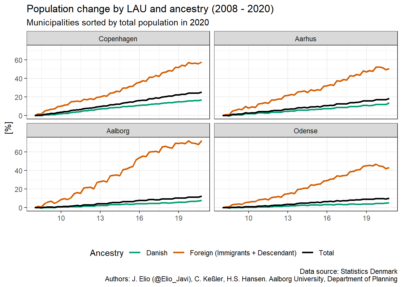
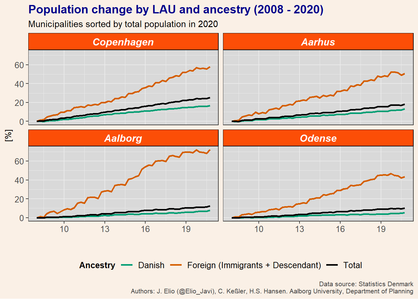
Now we have a nice figure but we can tune it a bit more by defining the non-data components of the plot with theme. Here, I show you an example of a customize plot. However, we can make changes on almost everything and I would recommend you to play a bit with it to get a better idea of the different options we have and to find your personal preferences.
p1 +
  theme(plot.title = element_text(size = 14, colour = "darkblue", face = "bold"),
        plot.caption = element_text(size = 8, colour = "grey25"),
        axis.text = element_text(size = 10),
        axis.title = element_text(size = 10),
        legend.title = element_text(size = 10, face = "bold"),
        legend.text = element_text(size = 10),
        plot.background = element_rect(fill = "linen", colour = NA),
        panel.background = element_rect(fill = "grey85", colour = NA),
        legend.background = element_rect(fill = "linen", color = NA),
        legend.key = element_rect(fill = "linen"),
        strip.text = element_text(size = 12, color = "white", face = "bold.italic"),
        strip.background = element_rect(color = "black", fill = "#FC4E07", linetype = "solid")
        )
Notes
I have created this post during my work as postdoctoral researcher at Aalborg University, in the project “Global flows of migrants and their impact on north European welfare states - FLOW”.
It is not endorsed by the university or the project, and it is not maintained. All the data I use here are public, and my only aim is that the post serves for learning R. For more information about migration and the project outcomes please visit the project’s website: https://www.flow.aau.dk.
Javier Elío
Associate Professor
My research interests include environmental sciences and data analysis.