Data visualization in R: animations
In the present post we will learn how to animate ggplot objects with gganimate. For that, we will create an animated map that represents the total population change in Denmark from 2008 to 2021. We will use two sets of data; the total population at the first day of the quarter in each municipality and the administrative units of Denmark. We have already seen in previous posts how to download and merge these datasets and, thus, I will not spend much time here. I have also created a sf object with the main regions in Denmark (Copenhagen, Aarhus, Odense, and Aalborg), which I will use to label the big cities in the animation.
Libraries
We will use the following libraries:
# Load Statistics Denmark data
  library(danstat)

# Data manipulation
  library(tidyverse)
  library(dint)
  library(furrr)

# Spatial data
  library(sf)
  library(giscoR)
  if(!require("devtools"))  install.packages("devtools")
  if(!require("ggsflabel")) devtools::install_github("yutannihilation/ggsflabel")
  library(ggsflabel)

# Animate ggplot objects
  library(gganimate)
Load data
- Population data:
# Load data
  id_table <- "FOLK1C"
  var_pop <- get_table_metadata(table_id = id_table, variables_only = TRUE)

  # loop by quarter for getting the data
  steps <- function(quarter){
    var_values <- list(id_region, id_ancestry, quarter)
    var_input <- purrr::map2(.x = var_codes, .y = var_values, .f = ~list(code = .x, values = .y))
    get_data(id_table, variables = var_input)
  }

  # Codes for var_input
  var_codes <- c("OMRÅDE", "HERKOMST", "Tid")

  # Values for var_input
  ## Region: Denmark
  id_region <- as.numeric(var_pop$values[[1]]$id)
  id_region <- id_region[id_region > 100]
  ## Ancestry (only total population)
  id_ancestry <- "TOT"
  ## Quarters
  id_quarter <- var_pop$values[[6]]$id   # Select all quarters
  # Parallel process with {future}
  plan(multisession)
  pop_LAU <- id_quarter %>% future_map(steps)
  pop_LAU <- bind_rows(pop_LAU)
  plan("default")

# Clean data
  pop_LAU <- pop_LAU %>%
    # Column names
    rename(LAU_NAME = OMRÅDE,
           ancestry = HERKOMST,
           date = TID,
           pop = INDHOLD) %>%
    # format date (first day of the quarter)
    mutate(date = gsub("Q", "", date),
           date = as_date_yq(as.integer(date)),
           date = first_of_quarter(date))  %>%
    # Standardize population growth to % change with 2008-Q1 as baseline
    group_by(LAU_NAME, ancestry) %>%
    arrange(LAU_NAME, date) %>%
    mutate(pop_pct_2008 = (pop/first(pop) - 1) * 100) %>%
ungroup() - Local Administrative Units (LAU):
# Create local directory for caching big files
  options(gisco_cache_dir = "C:/GISCO_spatial_data")

# Load LAUs data
  dk_lau <- gisco_get_lau(year = "2019", country = "DNK") %>%
    # Thanslate "København" = "Copenhagen"
mutate(LAU_NAME = gsub("København", "Copenhagen", LAU_NAME))- Join both datasets:
dk_lau_pop <- left_join(dk_lau, pop_LAU, by = "LAU_NAME") - Big cities/urban areas:
bc <- c("Copenhagen", "Aarhus", "Odense", "Aalborg")
big_cities <- dk_lau %>% filter(LAU_NAME %in% bc)
Animation
The package gganimate is an extension of ggplot2 where animations are defined by adding on layers of information in our code with the operator +. The basic function takes the form transition_xxx(), and it is where we define how the data should be treated. For example, we will use transition_states() which split the data based on the levels of a given column. However, there are other options that can be used depending on the structure of our data and what we would like to achieve. I would therefore recommend you to read the help for getting other transition options.
In this regards, the process of building an animation starts in a similar way that when we create a static graph. In our case, we have a sf objects (i.e. dk_lau_pop) and we would like to plot the population change over time (i.e. pop_pct_2008).
dk_lau_pop## Simple feature collection with 5247 features and 9 fields
## geometry type: GEOMETRY
## dimension: XY
## bbox: xmin: 8.07655 ymin: 54.56053 xmax: 15.19327 ymax: 57.75167
## geographic CRS: WGS 84
## First 10 features:
## CNTR_CODE LAU_NAME LAU_CODE FID GISCO_ID ancestry date pop
## 1 DK Kalundborg 326 DK_326 DK_326 Total 2008-01-01 49743
## 2 DK Kalundborg 326 DK_326 DK_326 Total 2008-04-01 49711
## 3 DK Kalundborg 326 DK_326 DK_326 Total 2008-07-01 49845
## 4 DK Kalundborg 326 DK_326 DK_326 Total 2008-10-01 49777
## 5 DK Kalundborg 326 DK_326 DK_326 Total 2009-01-01 49741
## 6 DK Kalundborg 326 DK_326 DK_326 Total 2009-04-01 49613
## 7 DK Kalundborg 326 DK_326 DK_326 Total 2009-07-01 49583
## 8 DK Kalundborg 326 DK_326 DK_326 Total 2009-10-01 49359
## 9 DK Kalundborg 326 DK_326 DK_326 Total 2010-01-01 49265
## 10 DK Kalundborg 326 DK_326 DK_326 Total 2010-04-01 49271
## pop_pct_2008 geometry
## 1 0.000000000 MULTIPOLYGON (((11.34888 55...
## 2 -0.064330660 MULTIPOLYGON (((11.34888 55...
## 3 0.205053977 MULTIPOLYGON (((11.34888 55...
## 4 0.068351326 MULTIPOLYGON (((11.34888 55...
## 5 -0.004020666 MULTIPOLYGON (((11.34888 55...
## 6 -0.261343305 MULTIPOLYGON (((11.34888 55...
## 7 -0.321653298 MULTIPOLYGON (((11.34888 55...
## 8 -0.771967915 MULTIPOLYGON (((11.34888 55...
## 9 -0.960939228 MULTIPOLYGON (((11.34888 55...
## 10 -0.948877229 MULTIPOLYGON (((11.34888 55...Therefore, we’d use geom_sf() for the static part as we saw in previous post:
p <- ggplot() +
  geom_sf(data = dk_lau_pop,
          aes(fill = pop_pct_2008),
          color = "grey",
          size = 0.05) +
  scale_fill_gradient2(name = "Change [%]",
                       low = "red",
                       mid = "white",
                       high = "blue",
                       midpoint = 0) +
  theme_bw() +
  geom_sf_label_repel(data = big_cities,
                      aes(label = LAU_NAME),
                      force = 20,
                      nudge_y = 1,
                      nudge_x = 2,
                      seed = 15) +
  labs(title = "Danish population change by LAUs",
       x = "",
       y = "",
       caption = "Data sources: Statistics Denmark and ©EuroGeographics\nAuthor: J. Elio (@Elio_Javi), C. Keßler, H.S. Hansen.\nAalborg University, Department of Planning")

p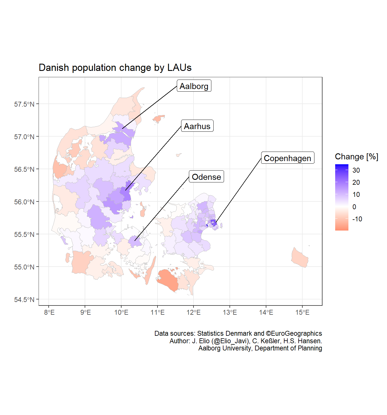
Once we have the static part, we add the functions for the animation. As we can see in our data (dk_lau_pop), there is a column called “date” that represents the first day of the quarter where we have population data. It goes from “2008-01-01” to “2021-01-01” and thus we can use transition_states() to split our data based on those dates and plot them individually.
anim_1 <- p + transition_states(date)

# Export animation (.gif)
anim_save("anim_1.gif", anim_1)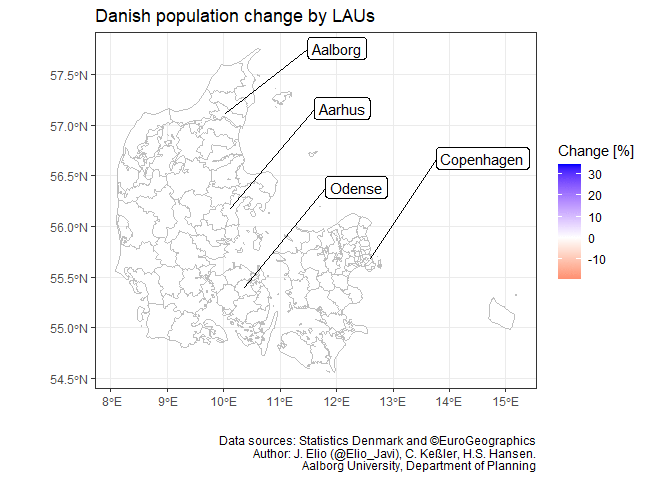
Finally, we should add labels that help us to interpret the transition stages (e.g. add a subtitle with the dates). We can do that by providing a frame variable to our plot. In our case, as we have used transition_states(), we can use closest_state which is the name of each state we split the data (i.e. date). However, different transitions provide different frame variables and we may need to use other frame variable (e.g. frame).
anim_2 <- anim_1 + labs(subtitle = "Date: {closest_state}")

# Export animation
 anim_save("anim_2.gif", anim_2)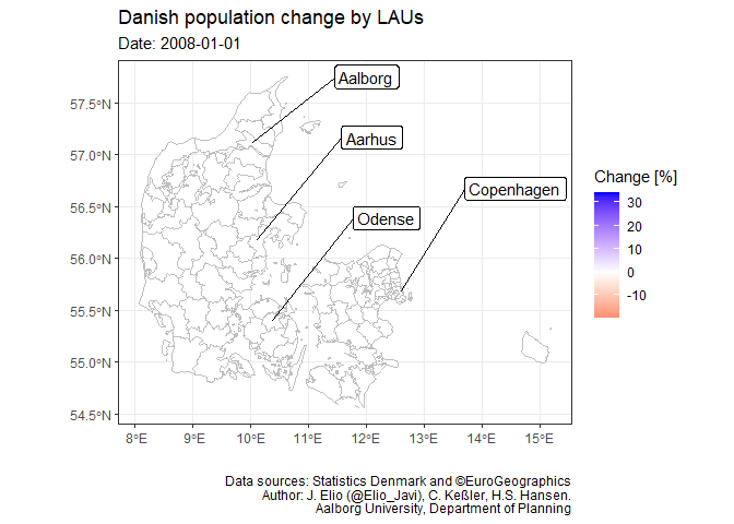
Notes
I have created this post during my work as postdoctoral researcher at Aalborg University, in the project “Global flows of migrants and their impact on north European welfare states - FLOW”.
It is not endorsed by the university or the project, and it is not maintained. All the data I use here are public, and my only aim is that the post serves for learning R. For more information about migration and the project outcomes please visit the project’s website: https://www.flow.aau.dk.
Javier Elío
Associate Professor
My research interests include environmental sciences and data analysis.