Data visualization in R: spatial data
In this tutorial we will see how to plot spatial data in R. We will use ggplot2 because we can apply what we already have learnt about creating graphs. Furthermore, it integrates very well with packages dealing with spatial data; as sf. However, there are several other packages especially created for plotting spatial data that I would also recommend. For example, if you were interested in static maps (as we are doing here), tmap or cartography would be good options. If, on the other hand, you wanted to create interactive maps, leaflet would be probably the best option. mapview is also a good alternative to inspect our data. Finally, mapdeck seems to be a very powerful tool but I have not used it (yet!!).
In the present post we will:
- Download administrative units of Denmark (i.e. LAUs)
- Add the spatial information to our data
- Create static maps with ggplot2
- Plot a continuous variable as discrete
- Add labels into a map
- Annotate text on individual facets
Libraries
We will use the following libraries:
library(tidyverse)
library(danstat)
library(furrr)
library(forcats)
library(dint)
library(sf)
library(giscoR)
Load data
We need two sets of data, the population data and the administrative units of Denmark. As we saw before, we can use the package danstat for the first set of data. However, we will need another package for the administrative units. In particular, I’ll use the giscoR package, which helps us to load geographical information directly from Eurostat - GISCO (the Geographic Information System of the Commission).
Population data
I will use the population at the first day of the quarter by region, sex, age (5 years age groups), ancestry and country of origin (table FOLK1C).
# Load data
  id_table <- "FOLK1C"
  var_pop <- get_table_metadata(table_id = id_table, variables_only = TRUE)

  # loop by quarter for getting the data
  steps <- function(quarter){
    var_values <- list(id_region, id_ancestry, quarter)
    var_input <- purrr::map2(.x = var_codes, .y = var_values, .f = ~list(code = .x, values = .y))
    get_data(id_table, variables = var_input)
  }

  # Codes for var_input
  var_codes <- c("OMRÅDE", "HERKOMST", "Tid")

  # Values for var_input
  ## Region: Denmark
  id_region <- as.numeric(var_pop$values[[1]]$id)
  id_region <- id_region[id_region > 100]
  ## Ancestry
  id_ancestry <- NA
  ## Quarters
  id_quarter <- var_pop$values[[6]]$id   # Select all quarters
  # Parallel process with {future}
  plan(multiprocess)
  pop_LAU <- id_quarter %>% future_map(steps)
  pop_LAU <- bind_rows(pop_LAU)
  plan("default")

# Clean data

pop_LAU <- pop_LAU %>%
  # column names
  rename(LAU_NAME = OMRÅDE,
         ancestry = HERKOMST,
         date = TID,
         pop = INDHOLD) %>%
  # format date (first day of the quarter)
  mutate(date = gsub("Q", "", date),
         date = as_date_yq(as.integer(date)),
         date = first_of_quarter(date)) %>%
  # Format "Persons of Danish origin" = "Danish"
  mutate(ancestry = ifelse(ancestry == "Persons of Danish origin", "Danish", ancestry)) %>%
  # Short LAUs by Total population in 20208-Q1
  pivot_wider(c(LAU_NAME, date), names_from = ancestry, values_from = pop) %>%
  mutate(LAU_NAME = factor(LAU_NAME),
         LAU_NAME = fct_reorder2(LAU_NAME, date, Total, .fun = first2)) %>%
  pivot_longer(cols = c(Total, Danish, Immigrants, Descendant),
               names_to = "ancestry",
               values_to = "pop") %>%
  # Short ancestry
  mutate(ancestry = factor(ancestry),
         ancestry = fct_relevel(ancestry, "Immigrants", after = 1)) %>%
  # Standardize population growth to % change with 2008-Q1 as baseline
  group_by(LAU_NAME, ancestry) %>%
  arrange(LAU_NAME, date) %>%
  mutate(pop_pct_2008 = (pop/first(pop) - 1) * 100) %>%
  ungroup()

pop_LAU
## # A tibble: 20,988 x 5
## LAU_NAME date ancestry pop pop_pct_2008
## <fct> <date> <fct> <dbl> <dbl>
## 1 Copenhagen 2008-01-01 Total 509861 0
## 2 Copenhagen 2008-01-01 Danish 405954 0
## 3 Copenhagen 2008-01-01 Immigrants 77114 0
## 4 Copenhagen 2008-01-01 Descendant 26793 0
## 5 Copenhagen 2008-04-01 Total 511725 0.366
## 6 Copenhagen 2008-04-01 Danish 406239 0.0702
## 7 Copenhagen 2008-04-01 Immigrants 78552 1.86
## 8 Copenhagen 2008-04-01 Descendant 26934 0.526
## 9 Copenhagen 2008-07-01 Total 511686 0.358
## 10 Copenhagen 2008-07-01 Danish 405931 -0.00567
## # ... with 20,978 more rowsLocal Administrative Units (LAU)
The basic functions of the giscoR package take the format gisco_get_xxx, where we can load the information we want by adding the name of the data at the end (e.g. countries - gisco_get_countries(), Local Administrative Units - gisco_get_lau(), Nomenclature of Territorial Units for Statistics - gisco_get_nuts(), …; in the help we can see all the available data). The data are retrieved as simple feature (sf) objects. I would highly recommend to read the package vignette (Simple Features for R) for a good understanding of their structure; however, we can see them as an special format of data frames (or tibbles) where the geometry (e.g. points, polygons, linestring, multipoint, …) of our data is attached in a column (i.e. geometry). Therefore, we can use the standard functions for data manipulation or the dplyr verbs (e.g. select, filter, mutate,…).
We will retrieve the Danish LAUs (i.e. municipalities; function gisco_get_lau()). For that, we would need to specify the version of the dataset (i.e. year) and the country (Denmark = “DNK”). An important feature of the package is the option of caching files. Therefore, the first time we load a file into our session, it will be storage in a local directory for future request. This is very useful mainly for big files that can take some time to download, and I would suggest you therefore to set the local directory (i.e. options(gisco_cache_dir = “~/path/to/dir”)).
# Create local directory for caching big files
  options(gisco_cache_dir = "C:/GISCO_spatial_data")

# Load LAUs data
  dk_lau <- gisco_get_lau(year = "2019", country = "DNK")

  dk_lau
## Simple feature collection with 99 features and 5 fields
## geometry type: GEOMETRY
## dimension: XY
## bbox: xmin: 8.07655 ymin: 54.56053 xmax: 15.19327 ymax: 57.75167
## geographic CRS: WGS 84
## First 10 features:
## CNTR_CODE LAU_NAME LAU_CODE FID GISCO_ID
## 32175 DK Kalundborg 326 DK_326 DK_326
## 32176 DK Ringsted 329 DK_329 DK_329
## 32177 DK Slagelse 330 DK_330 DK_330
## 32178 DK Stevns 336 DK_336 DK_336
## 32180 DK Sorø 340 DK_340 DK_340
## 32181 DK Lejre 350 DK_350 DK_350
## 32265 DK Lolland 360 DK_360 DK_360
## 32266 DK Næstved 370 DK_370 DK_370
## 32267 DK Guldborgsund 376 DK_376 DK_376
## 32356 DK Vordingborg 390 DK_390 DK_390
## geometry
## 32175 MULTIPOLYGON (((11.34888 55...
## 32176 POLYGON ((11.91387 55.52988...
## 32177 MULTIPOLYGON (((11.51634 55...
## 32178 POLYGON ((12.21957 55.42506...
## 32180 POLYGON ((11.70521 55.40513...
## 32181 MULTIPOLYGON (((11.84655 55...
## 32265 MULTIPOLYGON (((11.56228 54...
## 32266 MULTIPOLYGON (((11.81607 55...
## 32267 MULTIPOLYGON (((11.9804 54....
## 32356 MULTIPOLYGON (((12.01129 55...Link population and LAUs
Now that we have the data, we will add the spatial information (dk_lau) to the population data by region (pop_LAU). As you can appreciate both datasets have a column called “LAU_NAME”. This is precisely the name of the Danish municipalities (e.g. Kalundborg, Ringsted, …), and therefore we will combine our datasets based on that information. First, we would need to double check there are not problems with the names (for example in one dataset they may be in Danish but in the other in English). We will do that by an anti_join, which allow us to detect the unmatched records.
anti_join(dk_lau, pop_LAU, by = "LAU_NAME")## Simple feature collection with 1 feature and 5 fields
## geometry type: MULTIPOLYGON
## dimension: XY
## bbox: xmin: 12.45304 ymin: 55.61189 xmax: 12.7377 ymax: 55.73171
## geographic CRS: WGS 84
## CNTR_CODE LAU_NAME LAU_CODE FID GISCO_ID geometry
## 1 DK København 101 DK_101 DK_101 MULTIPOLYGON (((12.64807 55...We can see there is a discrepancy between dk_lau and pop_LAU (i.e. København). This can be solved by translating the name into English (København = Copenhagen) on dk_lau.
dk_lau <- dk_lau %>% mutate(LAU_NAME = gsub("København", "Copenhagen", LAU_NAME))

anti_join(dk_lau, pop_LAU, by = "LAU_NAME")
## Simple feature collection with 0 features and 5 fields
## bbox: xmin: NA ymin: NA xmax: NA ymax: NA
## geographic CRS: WGS 84
## [1] CNTR_CODE LAU_NAME LAU_CODE FID GISCO_ID geometry
## <0 rows> (or 0-length row.names)And just to double check there are not rows form pop_LAU that do not exist in dk_lau:
anti_join(pop_LAU, dk_lau, by = "LAU_NAME")## # A tibble: 0 x 5
## # ... with 5 variables: LAU_NAME <fct>, date <date>, ancestry <fct>, pop <dbl>,
## # pop_pct_2008 <dbl>OK, now we have confirmed there are not unmatched records so we can join both tables.
dk_lau_pop <-  left_join(dk_lau, pop_LAU, by = "LAU_NAME")

dk_lau_pop
## Simple feature collection with 20988 features and 9 fields
## geometry type: GEOMETRY
## dimension: XY
## bbox: xmin: 8.07655 ymin: 54.56053 xmax: 15.19327 ymax: 57.75167
## geographic CRS: WGS 84
## First 10 features:
## CNTR_CODE LAU_NAME LAU_CODE FID GISCO_ID date ancestry pop
## 1 DK Kalundborg 326 DK_326 DK_326 2008-01-01 Total 49743
## 2 DK Kalundborg 326 DK_326 DK_326 2008-01-01 Danish 47425
## 3 DK Kalundborg 326 DK_326 DK_326 2008-01-01 Immigrants 1810
## 4 DK Kalundborg 326 DK_326 DK_326 2008-01-01 Descendant 508
## 5 DK Kalundborg 326 DK_326 DK_326 2008-04-01 Total 49711
## 6 DK Kalundborg 326 DK_326 DK_326 2008-04-01 Danish 47384
## 7 DK Kalundborg 326 DK_326 DK_326 2008-04-01 Immigrants 1814
## 8 DK Kalundborg 326 DK_326 DK_326 2008-04-01 Descendant 513
## 9 DK Kalundborg 326 DK_326 DK_326 2008-07-01 Total 49845
## 10 DK Kalundborg 326 DK_326 DK_326 2008-07-01 Danish 47472
## pop_pct_2008 geometry
## 1 0.00000000 MULTIPOLYGON (((11.34888 55...
## 2 0.00000000 MULTIPOLYGON (((11.34888 55...
## 3 0.00000000 MULTIPOLYGON (((11.34888 55...
## 4 0.00000000 MULTIPOLYGON (((11.34888 55...
## 5 -0.06433066 MULTIPOLYGON (((11.34888 55...
## 6 -0.08645229 MULTIPOLYGON (((11.34888 55...
## 7 0.22099448 MULTIPOLYGON (((11.34888 55...
## 8 0.98425197 MULTIPOLYGON (((11.34888 55...
## 9 0.20505398 MULTIPOLYGON (((11.34888 55...
## 10 0.09910385 MULTIPOLYGON (((11.34888 55...Finally, we will only plot the population change from 2008 to 2020 (i.e. pop_pct_2008). Therefore, we are only interested in the situation in 2020, and we may filter our dataset based on date = 2020-07-01.
dk_lau_pop <- filter(dk_lau_pop, date == as.Date("2020-07-01"))

dk_lau_pop
## Simple feature collection with 396 features and 9 fields
## geometry type: GEOMETRY
## dimension: XY
## bbox: xmin: 8.07655 ymin: 54.56053 xmax: 15.19327 ymax: 57.75167
## geographic CRS: WGS 84
## First 10 features:
## CNTR_CODE LAU_NAME LAU_CODE FID GISCO_ID date ancestry pop
## 1 DK Kalundborg 326 DK_326 DK_326 2020-07-01 Total 48374
## 2 DK Kalundborg 326 DK_326 DK_326 2020-07-01 Danish 44717
## 3 DK Kalundborg 326 DK_326 DK_326 2020-07-01 Immigrants 2793
## 4 DK Kalundborg 326 DK_326 DK_326 2020-07-01 Descendant 864
## 5 DK Ringsted 329 DK_329 DK_329 2020-07-01 Total 34852
## 6 DK Ringsted 329 DK_329 DK_329 2020-07-01 Danish 29891
## 7 DK Ringsted 329 DK_329 DK_329 2020-07-01 Immigrants 3568
## 8 DK Ringsted 329 DK_329 DK_329 2020-07-01 Descendant 1393
## 9 DK Slagelse 330 DK_330 DK_330 2020-07-01 Total 79155
## 10 DK Slagelse 330 DK_330 DK_330 2020-07-01 Danish 69682
## pop_pct_2008 geometry
## 1 -2.752146 MULTIPOLYGON (((11.34888 55...
## 2 -5.710069 MULTIPOLYGON (((11.34888 55...
## 3 54.309392 MULTIPOLYGON (((11.34888 55...
## 4 70.078740 MULTIPOLYGON (((11.34888 55...
## 5 8.600274 POLYGON ((11.91387 55.52988...
## 6 2.359427 POLYGON ((11.91387 55.52988...
## 7 82.413088 POLYGON ((11.91387 55.52988...
## 8 49.143469 POLYGON ((11.91387 55.52988...
## 9 2.192184 MULTIPOLYGON (((11.51634 55...
## 10 -2.263802 MULTIPOLYGON (((11.51634 55...Plot the map
sf objects are added in ggplot2 with the argument geom_sf(). It is an especial geom, where we define the data and it plots lines, polygons or points depending on the geometry column of our dataset. Furthermore, we do not need to define the geometry column since ggplot2 use by default the primary geometry column. Finally, we can apply what we already know about ggplot2 (i.e. sacale_xxx, faceting, add titles, subtitles, themes, etc.) for tuning our map. For example, we can use facet_wrap() for plotting four maps based on ancestry (Total, Danish, Immigrants, and Descendants).
ggplot() +
    geom_sf(data = dk_lau_pop, aes(fill = pop_pct_2008)) +
    scale_fill_viridis_c(name = "Percentage") +
    labs(title = "Danish population change by LAUs",
         subtitle = "Period: 2008 - 2020",
         caption = "Data source: Statistics Denmark and ©EuroGeographics for the administrative boundaries\nAuthor: J. Elio (@Elio_Javi), C. Keßler, H.S. Hansen. Aalborg University, Department of Planning",
         x = "",
         y = "") +
    theme_bw() +
    facet_wrap( ~ ancestry, ncol = 2)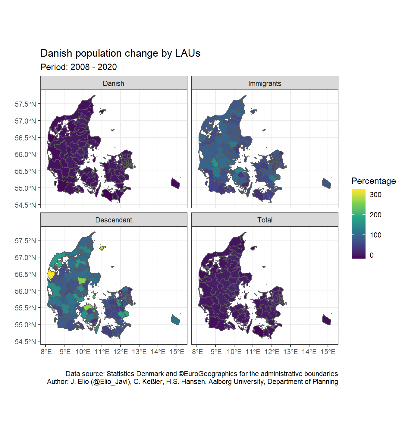
For improving the map we can do:
- Put the total population panel in the top left corner
We need to reorder the factors of ancestry in a way that Total is the first value (fct_relevel()):
levels(dk_lau_pop$ancestry)## [1] "Danish" "Immigrants" "Descendant" "Total"dk_lau_pop <- dk_lau_pop %>%
mutate(ancestry = factor(ancestry),
ancestry = fct_relevel(ancestry, "Total", after = 0))
levels(dk_lau_pop$ancestry)## [1] "Total" "Danish" "Immigrants" "Descendant"- Change the percentage scale
As we can see, there percentage of population change between immigrants and their descendants is much higher than for the Total and Danish population. Therefore, we do not really appreciate the changes in the former panels. We can solve it by plotting the variable as discrete so that, we can easily identify the different levels. We can use the base R function cut() to create therefore a new variable (pop_pct_2008_brk) with the bins we define (pct_breaks).
pct_breaks <- c(floor(min(dk_lau_pop$pop_pct_2008)), -10, -5,
                0, 5, 10, 20, 30, 50, 100, 200, max(dk_lau_pop$pop_pct_2008))

dk_lau_pop <- dk_lau_pop %>%
  mutate(pop_pct_2008_brk = cut(dk_lau_pop$pop_pct_2008, breaks = pct_breaks))

dk_lau_pop
## Simple feature collection with 396 features and 10 fields
## geometry type: GEOMETRY
## dimension: XY
## bbox: xmin: 8.07655 ymin: 54.56053 xmax: 15.19327 ymax: 57.75167
## geographic CRS: WGS 84
## First 10 features:
## CNTR_CODE LAU_NAME LAU_CODE FID GISCO_ID date ancestry pop
## 1 DK Kalundborg 326 DK_326 DK_326 2020-07-01 Total 48374
## 2 DK Kalundborg 326 DK_326 DK_326 2020-07-01 Danish 44717
## 3 DK Kalundborg 326 DK_326 DK_326 2020-07-01 Immigrants 2793
## 4 DK Kalundborg 326 DK_326 DK_326 2020-07-01 Descendant 864
## 5 DK Ringsted 329 DK_329 DK_329 2020-07-01 Total 34852
## 6 DK Ringsted 329 DK_329 DK_329 2020-07-01 Danish 29891
## 7 DK Ringsted 329 DK_329 DK_329 2020-07-01 Immigrants 3568
## 8 DK Ringsted 329 DK_329 DK_329 2020-07-01 Descendant 1393
## 9 DK Slagelse 330 DK_330 DK_330 2020-07-01 Total 79155
## 10 DK Slagelse 330 DK_330 DK_330 2020-07-01 Danish 69682
## pop_pct_2008 geometry pop_pct_2008_brk
## 1 -2.752146 MULTIPOLYGON (((11.34888 55... (-5,0]
## 2 -5.710069 MULTIPOLYGON (((11.34888 55... (-10,-5]
## 3 54.309392 MULTIPOLYGON (((11.34888 55... (50,100]
## 4 70.078740 MULTIPOLYGON (((11.34888 55... (50,100]
## 5 8.600274 POLYGON ((11.91387 55.52988... (5,10]
## 6 2.359427 POLYGON ((11.91387 55.52988... (0,5]
## 7 82.413088 POLYGON ((11.91387 55.52988... (50,100]
## 8 49.143469 POLYGON ((11.91387 55.52988... (30,50]
## 9 2.192184 MULTIPOLYGON (((11.51634 55... (0,5]
## 10 -2.263802 MULTIPOLYGON (((11.51634 55... (-5,0]- Identify big cities/urban areas in the map:
We can label the big regions of Denmark (Copenhagen, Aarhus, Odense, Aalborg) in the first panel. We would need therefore a sf object with the cities we want to label (i.e. big_cities). We do that by filtering the big cities in dk_lau. Then, since we only want to label the first panel (Total), we create an ancestry column with only this value and convert it to a factor vector with all the levels of ancestry (and in the same order): i.e. Total, Danish, Immigrants, Descendant. That way, when we use facet_wrap(), ggplot2 will identify all the levels but only plot the labels in the first one (Total).
big_cities <- c("Copenhagen", "Aarhus", "Odense", "Aalborg")

big_cities <- dk_lau %>%
  filter(LAU_NAME %in% big_cities) %>%
  mutate(ancestry = "Total",
         ancestry = factor(ancestry, levels = levels(dk_lau_pop$ancestry)))

big_cities
## Simple feature collection with 4 features and 6 fields
## geometry type: GEOMETRY
## dimension: XY
## bbox: xmin: 9.39194 ymin: 55.28856 xmax: 12.7377 ymax: 57.22925
## geographic CRS: WGS 84
## CNTR_CODE LAU_NAME LAU_CODE FID GISCO_ID geometry
## 1 DK Odense 461 DK_461 DK_461 POLYGON ((10.20275 55.40556...
## 2 DK Copenhagen 101 DK_101 DK_101 MULTIPOLYGON (((12.64807 55...
## 3 DK Aarhus 751 DK_751 DK_751 POLYGON ((10.2663 56.02372,...
## 4 DK Aalborg 851 DK_851 DK_851 MULTIPOLYGON (((9.57477 56....
## ancestry
## 1 Total
## 2 Total
## 3 Total
## 4 Totallevels(big_cities$ancestry)## [1] "Total" "Danish" "Immigrants" "Descendant"We can use geom_sf_label for adding labels. However, in this case they will appear together in the map and it would be difficult to read them. We can use therefore an approach similar to ggrepel::geom_label_repel (“the text labels repel away from each other and away from the data points”) but with sf objects. We use therefore the function geom_sf_label_repel() from the package ggsflabel. It is not yet on CRAN but we can download it directly from GitHub.
if(!require("devtools"))  install.packages("devtools")
if(!require("ggsflabel")) devtools::install_github("yutannihilation/ggsflabel")
library(ggsflabel)- Create our own colour palette (from red to blue):
Finally, we can create our own colour palette for representing negative values (population loss) in red and the positive ones (population gain) in blue with RColorBrewer.
library(RColorBrewer)
myPalette <- c(rev(brewer.pal(3, "YlOrRd")), brewer.pal(9, "Blues"))
And the final map
I played a bit with ylim, nudge_y, and nudge_x until I got readable labels.
ggplot() +
  geom_sf(data = dk_lau_pop,
          aes(fill = pop_pct_2008_brk),
          color = "grey50",
          size = 0.05) +
  scale_fill_manual(name = "Percentage", values = myPalette, drop = FALSE) +
  labs(title = "Danish population change by LAUs",
       subtitle = "Period: 2008 - 2020",
       caption = "Data source: Statistics Denmark and ©EuroGeographics for the administrative boundaries\nAuthor: J. Elio (@Elio_Javi), C. Keßler, H.S. Hansen. Aalborg University, Department of Planning",
       x = "",
       y = "") +
  theme_bw() +
  ylim(54.50, 58.0) +
  # # Test geom_sf_label (remove  geom_sf_label_repel())
  # geom_sf_label(data = big_cities, aes(label = LAU_NAME)) +
  geom_sf_label_repel(data = big_cities,
                      aes(label = LAU_NAME),
                      force = 10,
                      nudge_y = 5,
                      nudge_x = 0.5,
                      seed = 10
                ) +
  facet_wrap( ~ ancestry, ncol = 2)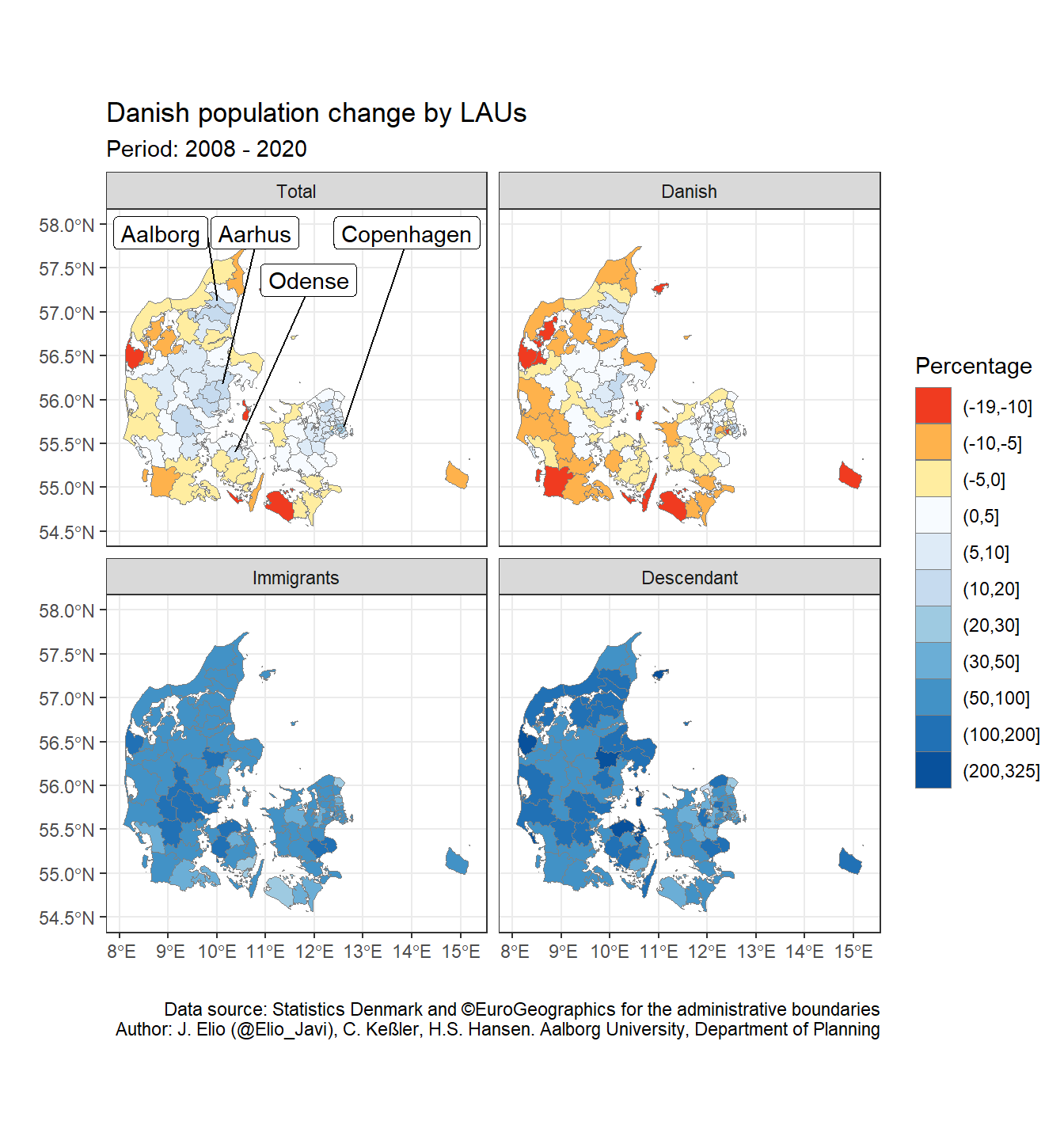
Notes
I have created this post during my work as postdoctoral researcher at Aalborg University, in the project “Global flows of migrants and their impact on north European welfare states - FLOW”.
It is not endorsed by the university or the project, and it is not maintained. All the data I use here are public, and my only aim is that the post serves for learning R. For more information about migration and the project outcomes please visit the project’s website: https://www.flow.aau.dk.
Javier Elío
Associate Professor
My research interests include environmental sciences and data analysis.